Avada Theme Examples: 26 Real WordPress Sites
Avada is worth buying if you want one theme that can be almost anything. It is $69 for a regular ThemeForest licence, it has passed a million sales, and the twenty-six live examples below show the range, from a Dartmoor riding holiday operator to a wealth manager and a food truck. Prices checked September 2026.
Avada is the best-selling WordPress theme of all time, with 1,070,533 sales and a 4.78-star average from more than 26,000 reviews on ThemeForest. It works with WooCommerce, bbPress and Gravity Forms, and it is the standing example of how far one flexible WordPress theme can be stretched.
One buying note before you start: Avada is sold as a single ThemeForest licence rather than through the Envato Elements subscription, so do not sign up to Elements expecting it to be included. Our guide to what Envato Elements actually costs explains what the subscription does and does not cover.
 MoniDesign works in art, branding and communication, and the site leans hard on Avada’s image handling to carry that. Worth borrowing if your work is visual and you want the pictures to do the arguing rather than the copy.
Visit MoniDesign
MoniDesign works in art, branding and communication, and the site leans hard on Avada’s image handling to carry that. Worth borrowing if your work is visual and you want the pictures to do the arguing rather than the copy.
Visit MoniDesign
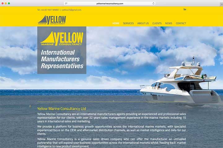 This one lays out a consultancy’s services plainly, showing how it connects buyers with manufacturers. Custom backgrounds and a responsive layout do the work; the lesson is that a niche B2B service does not need to look complicated.
Visit Yellow Marine Consultancy
This one lays out a consultancy’s services plainly, showing how it connects buyers with manufacturers. Custom backgrounds and a responsive layout do the work; the lesson is that a niche B2B service does not need to look complicated.
Visit Yellow Marine Consultancy
 Liberty Trails runs high-end horse riding holidays on Dartmoor, and the site is the best example here of selling an experience rather than a product. Video backgrounds, guest testimonials and press coverage build the case, and the navigation splits cleanly into set-date signature events and bespoke private trips, so a visitor self-selects before they enquire.
Visit Liberty Trails
Liberty Trails runs high-end horse riding holidays on Dartmoor, and the site is the best example here of selling an experience rather than a product. Video backgrounds, guest testimonials and press coverage build the case, and the navigation splits cleanly into set-date signature events and bespoke private trips, so a visitor self-selects before they enquire.
Visit Liberty Trails
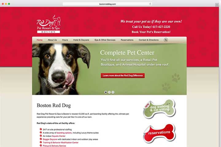 A pet resort and spa that puts every service on the homepage rather than hiding them behind a menu. If you sell several things to the same local audience, this is the pattern to copy.
Visit Red Dog
A pet resort and spa that puts every service on the homepage rather than hiding them behind a menu. If you sell several things to the same local audience, this is the pattern to copy.
Visit Red Dog
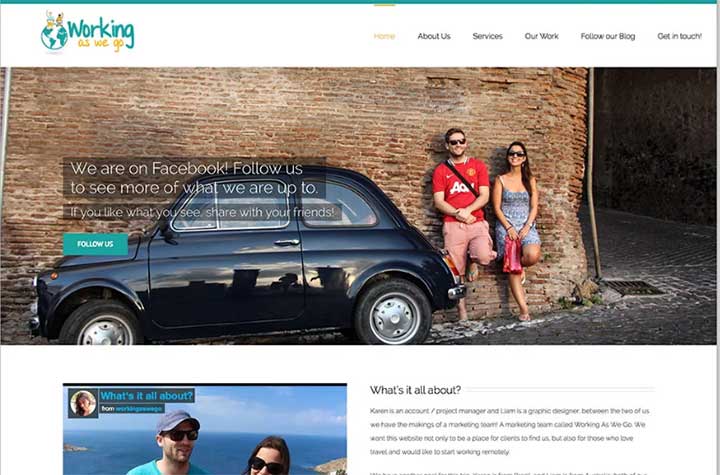 Part advertising and marketing agency, part travel diary. It is a good demonstration of running two voices on one site without the result feeling confused.
Visit Working As We Go
Part advertising and marketing agency, part travel diary. It is a good demonstration of running two voices on one site without the result feeling confused.
Visit Working As We Go
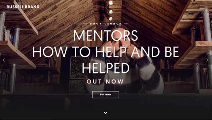 Podcasts, writing and recovery work, with a proper blog section at the centre of it. Proof that Avada handles a publishing site as happily as a brochure one.
Visit Russell Brand
Podcasts, writing and recovery work, with a proper blog section at the centre of it. Proof that Avada handles a publishing site as happily as a brochure one.
Visit Russell Brand
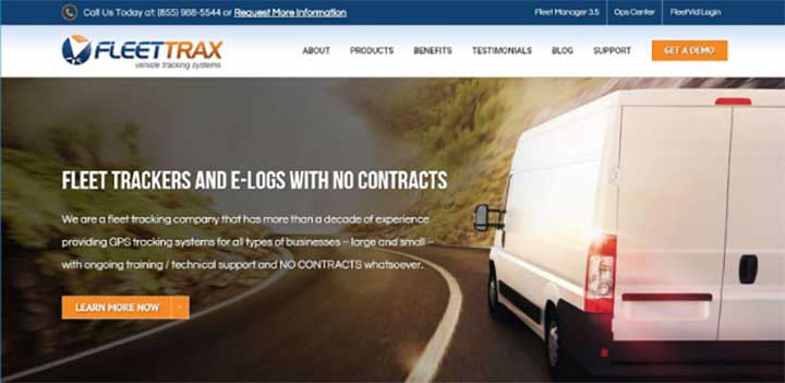 Asset trackers, dispatch software and fleet devices, presented so that a fleet manager can find the right product in two clicks. Technical products, simple navigation.
Visit FleetTrax
Asset trackers, dispatch software and fleet devices, presented so that a fleet manager can find the right product in two clicks. Technical products, simple navigation.
Visit FleetTrax
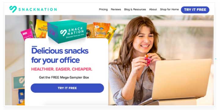 An office snack delivery service with a homepage built entirely around one offer. If your business has a single conversion goal, this is what that looks like.
Visit Snack Nation
An office snack delivery service with a homepage built entirely around one offer. If your business has a single conversion goal, this is what that looks like.
Visit Snack Nation
 Residential and commercial cleaning across driveways, pools, garages, decks, buildings and pavements. A long service list handled without the menu collapsing under it, which is the hardest thing about a trades site.
Visit ClearView Surfaces
Residential and commercial cleaning across driveways, pools, garages, decks, buildings and pavements. A long service list handled without the menu collapsing under it, which is the hardest thing about a trades site.
Visit ClearView Surfaces
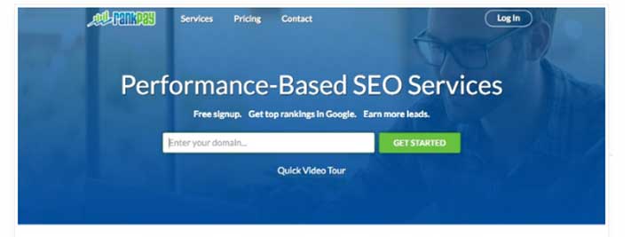 An SEO service covering blog writing, PPC, social marketing and content management, with each service given its own page rather than a bullet on a list. Useful if you sell retainers.
Visit RankPay
An SEO service covering blog writing, PPC, social marketing and content management, with each service given its own page rather than a bullet on a list. Useful if you sell retainers.
Visit RankPay
 A graphic design studio taking the restrained route: professional, elegant, and letting the portfolio speak. A reminder that a design agency site does not have to be a showreel.
Visit Bezign Creative
A graphic design studio taking the restrained route: professional, elegant, and letting the portfolio speak. A reminder that a design agency site does not have to be a showreel.
Visit Bezign Creative
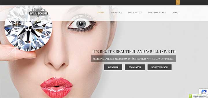 Vibrant product imagery over a straightforward buying flow. Jewellery is a category where the photography carries the sale, and the layout gets out of its way.
Visit International Jewelers Exchange
Vibrant product imagery over a straightforward buying flow. Jewellery is a category where the photography carries the sale, and the layout gets out of its way.
Visit International Jewelers Exchange
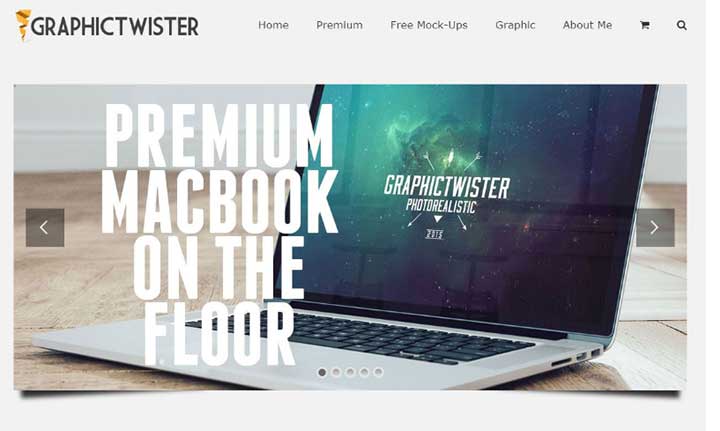 A library of PSD resources, which means hundreds of items to organise and filter. Worth a look if your site is really a catalogue.
Visit Graphic Twister
A library of PSD resources, which means hundreds of items to organise and filter. Worth a look if your site is really a catalogue.
Visit Graphic Twister
 Strong background treatment and easy navigation, and probably the clearest demonstration on this page of how far you can push Avada away from the look of its own demos.
Visit Bullish
Strong background treatment and easy navigation, and probably the clearest demonstration on this page of how far you can push Avada away from the look of its own demos.
Visit Bullish
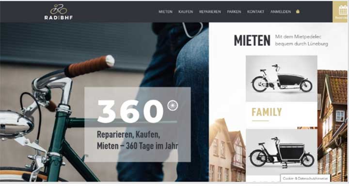 A split-screen layout with a reservation call to action, which keeps large background photography crisp while still pushing bookings. Good pattern for a restaurant or venue.
Visit Radspeicher
A split-screen layout with a reservation call to action, which keeps large background photography crisp while still pushing bookings. Good pattern for a restaurant or venue.
Visit Radspeicher
 Everything on one long scroll, so the whole proposition is readable without a single click. Suits a business with one clear story to tell.
Visit DigitalSolution
Everything on one long scroll, so the whole proposition is readable without a single click. Suits a business with one clear story to tell.
Visit DigitalSolution
 A local events site for Marblehead, leaning on big imagery and fast-loading service blocks. A good model for anything place-based.
Visit Wednesdays in Marblehead
A local events site for Marblehead, leaning on big imagery and fast-loading service blocks. A good model for anything place-based.
Visit Wednesdays in Marblehead
 The most-cited example of Avada at enterprise scale, and the one that tells you the theme can carry serious traffic and a very large content set without falling over.
Visit Visual Studio
The most-cited example of Avada at enterprise scale, and the one that tells you the theme can carry serious traffic and a very large content set without falling over.
Visit Visual Studio
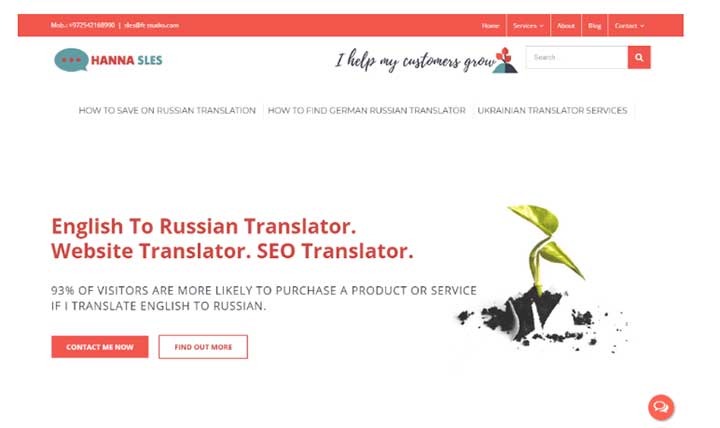 An English to Russian translator selling a personal service. Proof that a one-person business can look substantial without pretending to be an agency.
Visit Hanna Sles
An English to Russian translator selling a personal service. Proof that a one-person business can look substantial without pretending to be an agency.
Visit Hanna Sles
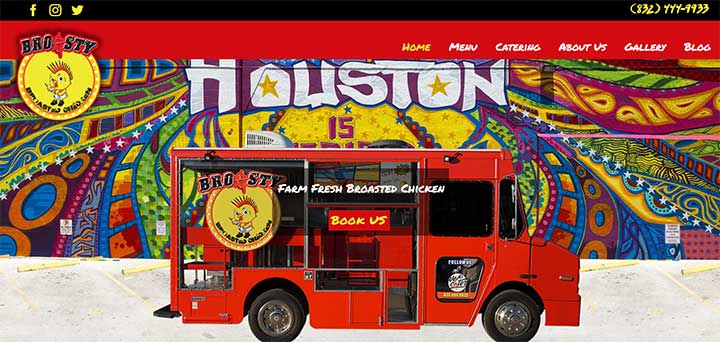 Funky, loud and nothing like a stock business demo. Useful if your brand has personality and you are worried a theme will flatten it.
Visit Broasty Food Truck
Funky, loud and nothing like a stock business demo. Useful if your brand has personality and you are worried a theme will flatten it.
Visit Broasty Food Truck
 A vertical menu instead of the usual horizontal bar, which changes the feel of the whole site. Worth studying if you want to look different without a custom build.
Visit Ninetail
A vertical menu instead of the usual horizontal bar, which changes the feel of the whole site. Worth studying if you want to look different without a custom build.
Visit Ninetail
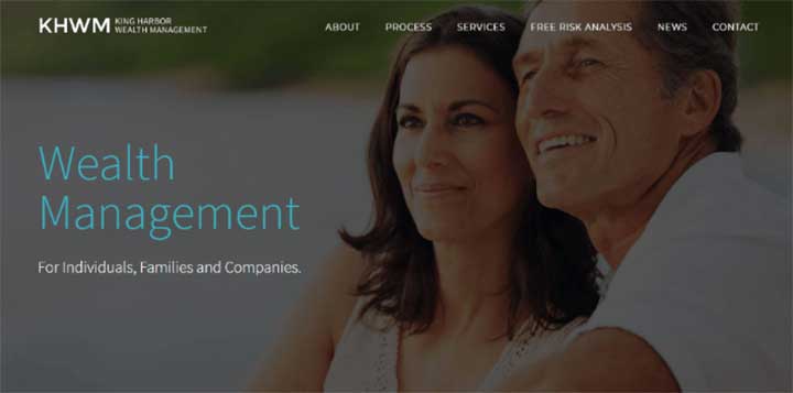 Financial advice presented with the sobriety the sector needs. The best example here of using Avada to build trust rather than excitement.
Visit King Harbor Wealth Management
Financial advice presented with the sobriety the sector needs. The best example here of using Avada to build trust rather than excitement.
Visit King Harbor Wealth Management
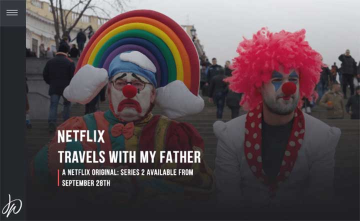 A performer’s portfolio site with confident colour work. Good reference for anyone whose brand is themselves.
Visit Jack Whitehall
A performer’s portfolio site with confident colour work. Good reference for anyone whose brand is themselves.
Visit Jack Whitehall
 Digital entertainment, and a useful source of ideas if you are building something media-led rather than service-led.
Visit Mass Impressions
Digital entertainment, and a useful source of ideas if you are building something media-led rather than service-led.
Visit Mass Impressions
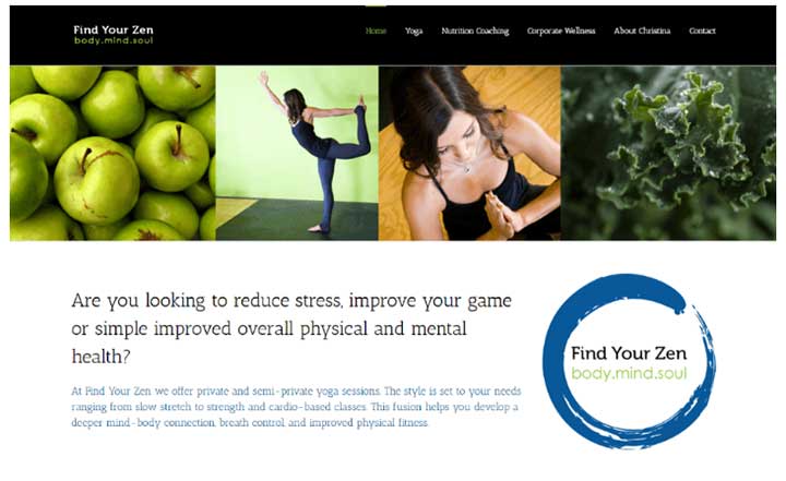 A stress and wellbeing site built on a very simple design, which is exactly right for the subject. Restraint is a design decision too.
Visit Find Your Zen
A stress and wellbeing site built on a very simple design, which is exactly right for the subject. Restraint is a design decision too.
Visit Find Your Zen
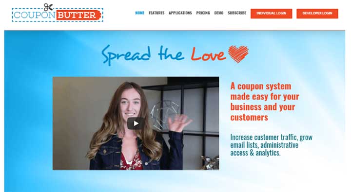 Offers and deals aggregated for shoppers, and readable on a phone as well as a desktop, which for a coupon site is the whole game.
Visit Coupon Butter
Offers and deals aggregated for shoppers, and readable on a phone as well as a desktop, which for a coupon site is the whole game.
Visit Coupon Butter
Download Avada Theme Affiliate link
26 Best Avada Theme Examples
#1. MoniDesign
MoniDesign works in art, branding and communication, and the site leans hard on Avada’s image handling to carry that. Worth borrowing if your work is visual and you want the pictures to do the arguing rather than the copy.
Visit MoniDesign
#2. Yellow Marine Consultancy
This one lays out a consultancy’s services plainly, showing how it connects buyers with manufacturers. Custom backgrounds and a responsive layout do the work; the lesson is that a niche B2B service does not need to look complicated.
Visit Yellow Marine Consultancy
#3. Liberty Trails
Liberty Trails runs high-end horse riding holidays on Dartmoor, and the site is the best example here of selling an experience rather than a product. Video backgrounds, guest testimonials and press coverage build the case, and the navigation splits cleanly into set-date signature events and bespoke private trips, so a visitor self-selects before they enquire.
Visit Liberty Trails
#4. Red Dog
A pet resort and spa that puts every service on the homepage rather than hiding them behind a menu. If you sell several things to the same local audience, this is the pattern to copy.
Visit Red Dog
#5. Working As We Go
Part advertising and marketing agency, part travel diary. It is a good demonstration of running two voices on one site without the result feeling confused.
Visit Working As We Go
#6. Russell Brand
Podcasts, writing and recovery work, with a proper blog section at the centre of it. Proof that Avada handles a publishing site as happily as a brochure one.
Visit Russell Brand
#7. FleetTrax
Asset trackers, dispatch software and fleet devices, presented so that a fleet manager can find the right product in two clicks. Technical products, simple navigation.
Visit FleetTrax
#8. Snack Nation
An office snack delivery service with a homepage built entirely around one offer. If your business has a single conversion goal, this is what that looks like.
Visit Snack Nation
#9. ClearView Surfaces
Residential and commercial cleaning across driveways, pools, garages, decks, buildings and pavements. A long service list handled without the menu collapsing under it, which is the hardest thing about a trades site.
Visit ClearView Surfaces
#10. RankPay
An SEO service covering blog writing, PPC, social marketing and content management, with each service given its own page rather than a bullet on a list. Useful if you sell retainers.
Visit RankPay
#11. Bezign Creative
A graphic design studio taking the restrained route: professional, elegant, and letting the portfolio speak. A reminder that a design agency site does not have to be a showreel.
Visit Bezign Creative
#12. International Jewelers Exchange
Vibrant product imagery over a straightforward buying flow. Jewellery is a category where the photography carries the sale, and the layout gets out of its way.
Visit International Jewelers Exchange
#13. Graphic Twister
A library of PSD resources, which means hundreds of items to organise and filter. Worth a look if your site is really a catalogue.
Visit Graphic Twister
#14. Bullish
Strong background treatment and easy navigation, and probably the clearest demonstration on this page of how far you can push Avada away from the look of its own demos.
Visit Bullish
#15. Radspeicher
A split-screen layout with a reservation call to action, which keeps large background photography crisp while still pushing bookings. Good pattern for a restaurant or venue.
Visit Radspeicher
#16. DigitalSolution
Everything on one long scroll, so the whole proposition is readable without a single click. Suits a business with one clear story to tell.
Visit DigitalSolution
#17. Wednesdays in Marblehead
A local events site for Marblehead, leaning on big imagery and fast-loading service blocks. A good model for anything place-based.
Visit Wednesdays in Marblehead
#18. Microsoft Visual Studio
The most-cited example of Avada at enterprise scale, and the one that tells you the theme can carry serious traffic and a very large content set without falling over.
Visit Visual Studio
#19. Hanna Sles Translator
An English to Russian translator selling a personal service. Proof that a one-person business can look substantial without pretending to be an agency.
Visit Hanna Sles
#20. Broasty Food Truck
Funky, loud and nothing like a stock business demo. Useful if your brand has personality and you are worried a theme will flatten it.
Visit Broasty Food Truck
#21. Ninetail
A vertical menu instead of the usual horizontal bar, which changes the feel of the whole site. Worth studying if you want to look different without a custom build.
Visit Ninetail
#22. King Harbor Wealth Management
Financial advice presented with the sobriety the sector needs. The best example here of using Avada to build trust rather than excitement.
Visit King Harbor Wealth Management
#23. Jack Whitehall
A performer’s portfolio site with confident colour work. Good reference for anyone whose brand is themselves.
Visit Jack Whitehall
#24. Mass Impressions
Digital entertainment, and a useful source of ideas if you are building something media-led rather than service-led.
Visit Mass Impressions
#25. Find Your Zen
A stress and wellbeing site built on a very simple design, which is exactly right for the subject. Restraint is a design decision too.
Visit Find Your Zen
#26. Coupon Butter
Offers and deals aggregated for shoppers, and readable on a phone as well as a desktop, which for a coupon site is the whole game.
Visit Coupon Butter
Any other Avada Theme Example?
The pattern across all twenty-six is the same: Avada is not a look, it is a kit. The sites that work best are the ones that decided on a single job for the homepage first and then used Avada to do it.Download Avada Theme Affiliate link
Know an Avada site worth adding? Post the link in the comments and we will take a look.